Society Branding
How do you create a cohesive, corporate visual identity while celebrating individual characters?
Society is a global social media agency housed within the IPG umbrella. It brings a variety of people with very different skills and backgrounds to work together on projects big and small from Media to Publishing to Creative and Production. We wanted the visual identity to reflect the youthful energy, dynamism and melting pot of creativity, ideas and skills that reflected the diverse make up of the team and show how Society brings together individuals for the greater good.
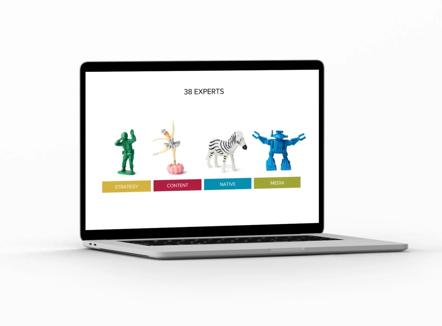
The hero image shows all the characters alongside each other showing the power of collaboration but also championing diversity and individuality . The hero image was used across the most prominent and external facing parts of the corporate visual identity - presentation decks, screensavers, social media pages etc.
We then asked each member of staff to choose a character for their individual corporate identity E.g email signature, business card etc.
This helped to create a strong and unified internal culture, helped to induct new members of staff and made the presentation of a project team to clients memorable and fun.
We created a series of backgrounds grouping characters in themes (space, animal, prima donnas) against each colour in the palette and used them for screensavers and as break slides in presentations.


We created a 4 colour palette to reflect the personality of the brand - confident, bright, bold and dynamic. We used the palette to bring together the character led visuals with more functional collateral like graphical data and written presentations.
In the spirit of collaboration, the logo was designed by a team mate in New York while I led the Sydney team on the rest of the visual identity. The brief for the logo was to show the forward looking, dynamic, ever evolving face of Society and to work with our bold colour palette and cast of characters.
We chose Proxima Nova which is a legible, modern, blocky style of san serif typeface which gives a bold, confident feel to the overall visual identity.
To ensure every member of the team no matter how design literate was able to use the visual identity effectively. We put together a master template presentation deck with every type of slide imaginable accounted for.


